
- 📖 Geeky Medics OSCE Book
- ⚡ Geeky Medics Bundles
- ✨ 1300+ OSCE Stations
- ✅ OSCE Checklist PDF Booklet
- 🧠 UKMLA AKT Question Bank
- 💊 PSA Question Bank
- 💉 Clinical Skills App
- 🗂️ Flashcard Collections | OSCE, Medicine, Surgery, Anatomy
- 💬 SCA Cases for MRCGP
To be the first to know about our latest videos subscribe to our YouTube channel 🙌
Statistics is something that many medical students struggle with. This is often not a problem until you undertake a research project or an intercalated degree when you suddenly realise how useful just a little knowledge on the subject can be.
This article is going to summarise the most important statistical measures and tests used in medical research so that they can be understood when reading research papers. We will also discuss the indications for using some of the tests. We hope this will serve as more of a primer for medical statistics than a comprehensive review.
Types of variable
In order to collect and analyse data appropriately, the variables involved must first be classified. The best statistical methods to use vary depending on the type of variables in question. The diagram below demonstrates a simple classification for variables:

Data may also be derived. This means that it undergoes some sort of conversion or analysis following the initial collection. For example, pre- and postoperative tumour volumes may be the data that is directly collected. The percentage of tumour volume reduction can then be derived from this.
Biases
Biases are systematic differences between the data that has been collected and the reality in the population. There are numerous types of bias to be aware of, some of which are listed below:
- Selection bias: error in the process of selecting participants for the study and assigning them to particular arms of the study.
- Attrition bias: when those patients who are lost to follow-up differ in a systematic way to those who did return for assessment or clinic.
- Measurement bias: when information is recorded in a distorted manner (e.g. an inaccurate measurement tool).
- Observer bias: when variables are reported differently between assessors.
- Procedure bias: subjects in different arms of the study are treated differently (other than the exposure or intervention).
- Central tendency bias: observed when a Likert scale is used with few options, and responses show a trend towards the centre of the scale.
- Misclassification bias: occurs when a variable is classified incorrectly.
Confounding variables
Confounding variables are those which are linked to the outcome but have not been accounted for in the study. For example, we may observe that as ice cream sales increase, so do the number of drownings. This is because ice cream sales will increase in the summer; simultaneously more people will be going for a swim. Therefore there is not a direct causative link between ice creams and drownings, but there is an indirect correlation that we have not accounted for.
Normal distribution
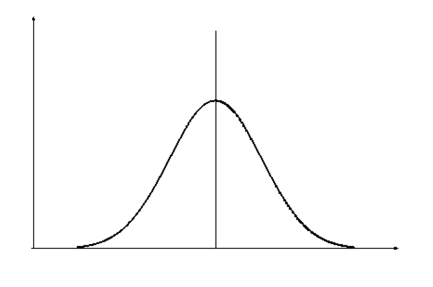
The normal distribution is one of the most important concepts to get to grips with. Below are summarised some key features of a normal distribution (figure 1):
- Mean, mode and median are all equal, and lie at the peak of the curve.
- 68% of the area under the curve is within 1 standard deviation either side of the mean.
- Normal distributions can be entirely defined in terms of the mean and standard deviation in the data set.
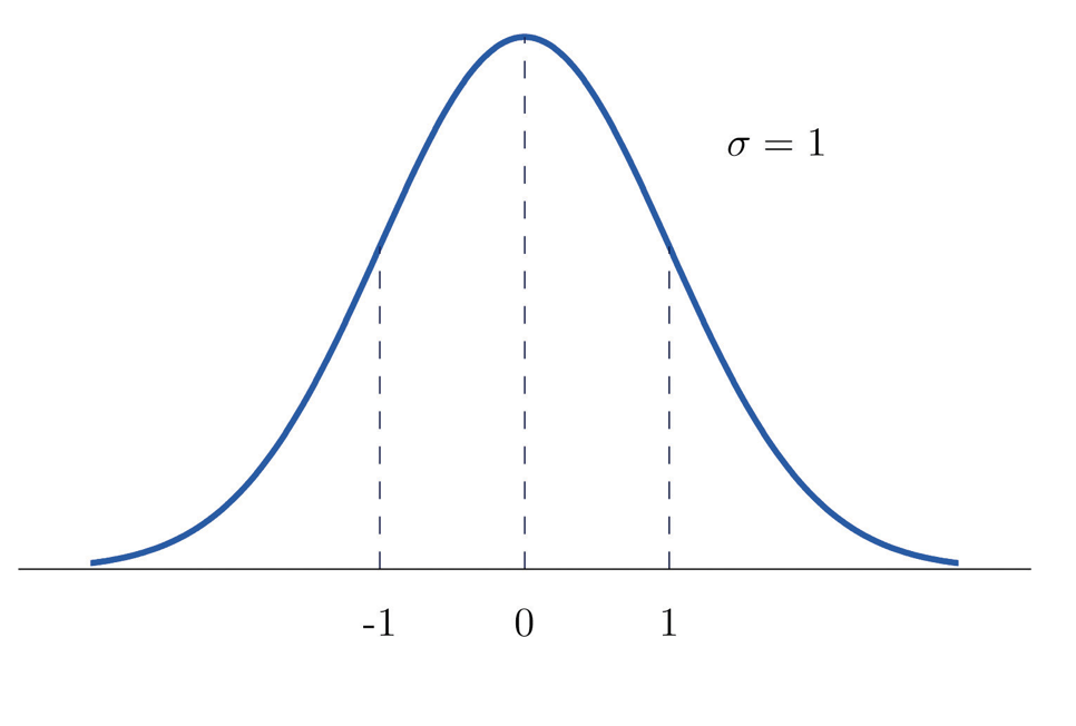
Standard normal distribution
A normal distribution with a mean of 0 and a standard deviation of 1 is called the standard normal distribution (SND) and has particular importance in statistics (figure 2). As the standard deviation of this graph is 1, any value on the x-axis is equal to the number of standard deviations away from the mean.
There are tables which correlate the percentage of the area under the curve to the value on the x-axis of the SND. A sample of such a table can be found below (table 1).
| Second decimal point of z | |||||
| Z | 0.00 | 0.01 | 0.02 | 0.03 | 0.04 |
| 1.0 | 0.1587 | 0.1562 | 0.1539 | 0.1515 | 0.1492 |
Table 1
From this, we can infer that beyond 1 standard deviation from the mean lies 15.87% of the area of the data. This also means that 31.74% of the data lies beyond 1 standard deviation on either side of the mean. This makes perfect sense as we would expect 68.26% of the data to lie within 1 standard deviation either side of the mean.
Any value on the x-axis of any normal distribution can be converted to a corresponding x-axis value on the standard normal distribution (a z-value) with the following equation:

You would use this equation if you wanted to find out what percentage of the data lay beyond a certain point or within a particular range on the curve of your normal data set.
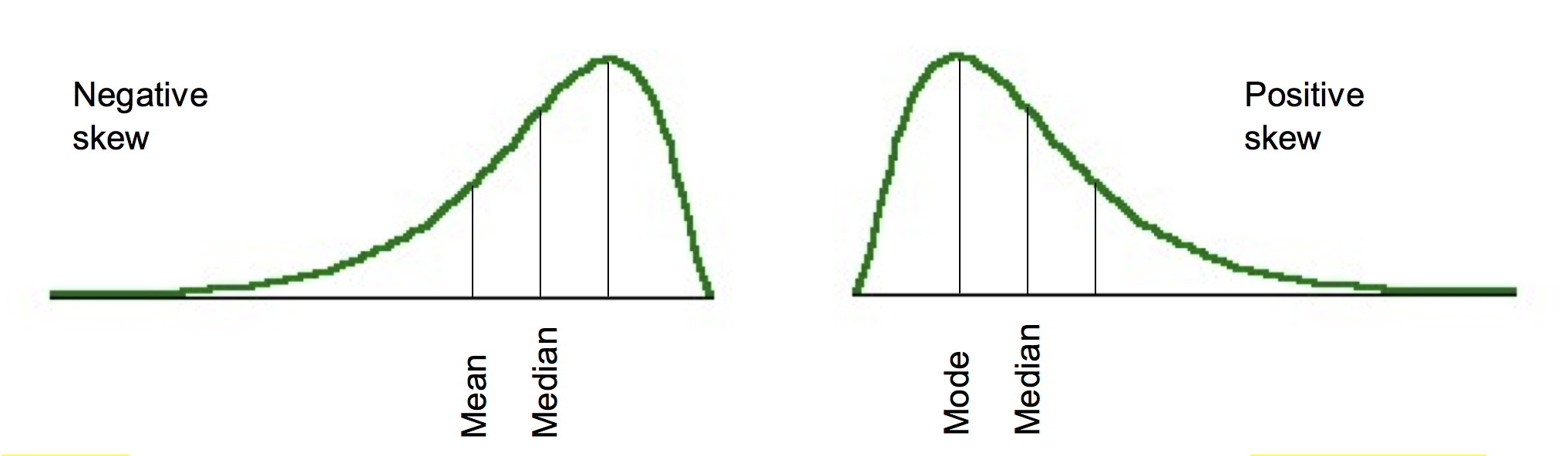
Although truly normal distributions are symmetrical about the mean, there may be some distortion in this. One type of distortion is skew. This is where the distribution is not symmetrical and has a more prominent tail pointing in one direction. A tail to the right is described as positive skew, a tail to the left is negative skew (figure 3). This means that the mean, mode and median are no longer equal.
Another distortion that may be present in the data is kurtosis. This can be thought of as the ‘pointiness’ of the peak in the distribution (figure 4). Positive kurtosis refers to a distribution that is more pointy (also called leptokurtosis); negative kurtosis refers to a flatter distribution (also called platykurtosis). Although kurtosis is most noticeable in terms of the sharpness of the peak, it is due to changes in the tails. When a small number of big deviations from the mean are recorded in the data, positive kurtosis is observed. Whereas large amounts of small deviations from the mean result in platykurtosis.

Sampling variation, standard deviation and standard error
In statistics, we want to draw conclusions about a population based on a smaller sample. The estimates we make about the broader population based on the sample are called sample statistics. If we were to take lots of samples, it is not likely that the sample statistics for each sample would be the same (this is due to sampling variation); however, there should be a tendency towards the true value for the population.
Let’s say we wanted to find the mean blood cholesterol of patients in a hospital. We would probably do this by taking a sample of patients from the hospital, and then calculate a sample statistic (in this case, mean blood cholesterol). Inferences could then be made based on this and extrapolated to the population of interest (i.e. from some of the patients in the hospital (our sample) to all of them (our population of interest)). If we do this lots of times we would generate lots of means – plotting the distribution of these means would give us the sampling distribution of the mean. If the sample size is large, the sampling distribution of the mean will have a normal distribution regardless of the actual distribution in the population. If the sample size is smaller, the sampling distribution of the mean will only be normal if the actual distribution in the population is normal.
The standard deviation among the means of all these samples can be calculated and is called the standard error of the mean. Just as we may calculate the mean and standard deviation for one of our samples, calculating the standard error of the mean is the standard deviation for our sampling distribution of the mean. Standard deviation is used to express variation in the data of our sample; standard error should be used to describe the precision in the sample mean (i.e. the mean of the sampling distribution of the mean). We do not need to take lots of samples to generate the standard error of the mean, instead, we can estimate it with the equation below.

Confidence intervals
In the previous section, we pretended that we were conducting a study in which all we wanted to do was find out the mean blood cholesterol for patients in a hospital. From a sample, we can generate sample statistics. Finding the mean blood cholesterol in our sample would generate a point estimate of the value for all the patients in the hospital. However, it may be more useful to find a range within which we think the value is going to lie (an interval estimate). With a 95% confidence interval (CI) we are saying that ‘we are 95% certain that the true value for the population lies within this range’. Therefore, larger intervals indicate more imprecise estimates of the mean.
The equation for calculating the confidence interval is below.
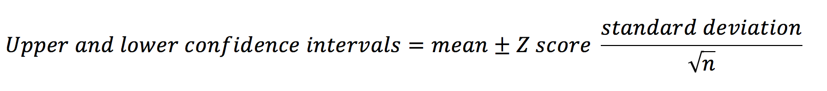 The z-score is a number that corresponds to the percentage of confidence interval you want to calculate (e.g. the z-score for an 80% CI = 1.282; the z-score for a 95% CI = 1.960). This is discussed in more depth below.
Z-tests and P-values
Hypothesis tests allow us to establish the likelihood that the association we are observing is genuine, or simply due to chance. They start with the statement of a null hypothesis – there will not be a significant difference in outcome between the groups. The p-value is effectively the probability that the null hypothesis is true. Therefore, the smaller the p-value becomes, the more likely that the null hypothesis is disproven.
Imagine we are conducting a study looking at the effect of an exposure on an outcome (e.g. the effect of smoking on GFR). We have two groups (an exposure and a control) and two mean outcome values (one for each group). Calculating the difference between the means and dividing this by the standard error gives a z-score. The z-score is the number of standard deviations away from the mean that the mean difference lies (or the value on the x-axis on the graph of the standard normal distribution (see the section on SND)).

In a similar fashion to how we could calculate the area under the curve between different points on the x-axis using the SND, we can find the p-value now that we have a z-score. Let’s say our z-score was 1.96. This corresponds to an area under the SND curve of 0.025. This means that beyond 1.96 on the x-axis of the SND lies 2.5% of the data on one side of the curve. Typically, two-sided p-values are used in analyses – this means that the assessment is of the size of the difference to the null hypothesis, not the direction in which that difference is (above or below the mean). It also means we have to double the area we have found as we need to look at points outside of -1.96 as well as 1.96. Based on this we find that 5% of the data lies outside of our interval between -1.96 and 1.96. As 5% is equal to 0.05 as a decimal, our p-value is 0.05 (which by conventional standards is the threshold for statistical significance).
Parametric and nonparametric tests
Although the normal distribution is very common in medical statistics, it is not the only way in which data can be distributed. Data distributed in a pattern that is not normal is described as nonparametric. Below are summarised the names of tests that should be performed in certain situations for parametric data (table 2). The corresponding test for nonparametric data is also given. In some cases, more than one test can be used to get identical results.
| Purpose | Parametric data | Nonparametric data |
| Assess the difference between two groups | Two-sample t-test |
Wilcoxon rank sum test Mann-Whitney U test Kendall’s S-test |
| Assess the difference between more than two groups | One-way analysis of variance (ANOVA) | Kruskal-Wallis test |
| Measure the strength of an association between two variables | Correlation coefficient |
Kendall’s tau rank correlation Spearman’s rank correlation |
| Assess the difference between paired observations | Paired t-test |
Wilcoxon signed rank test Sign test |
Table 2
Chi-squared test
Chi-squared tests (or Pearson’s chi-squared tests) are applied to establish whether there is a significant difference between two groups of categorical data. It works by comparing the observed data with the data that could be expected if the null hypothesis was true. It is calculated with the following equation:

Here is an example observed data set (table 3):
| Polio | No polio | Total | |
| Exposure | 20 | 300 | 320 |
| No exposure | 60 | 280 | 340 |
| Total | 80 | 580 | 660 |
Table 3
From this, we can find what the expected values would be (table 4). To do this we assume that the total values would be the same. First, we calculate the proportion of patients in the exposed and unexposed groups (exposed = and unexposed = ). This value is then multiplied by the total in the infected and uninfected groups. Note that it is acceptable to record expected values with decimal points.
| Polio | No polio | Total | |
| Exposure | 38.8 | 281.2 | 320 |
| No exposure | 41.2 | 298.8 | 340 |
| Total | 80 | 580 | 660 |
Table 4
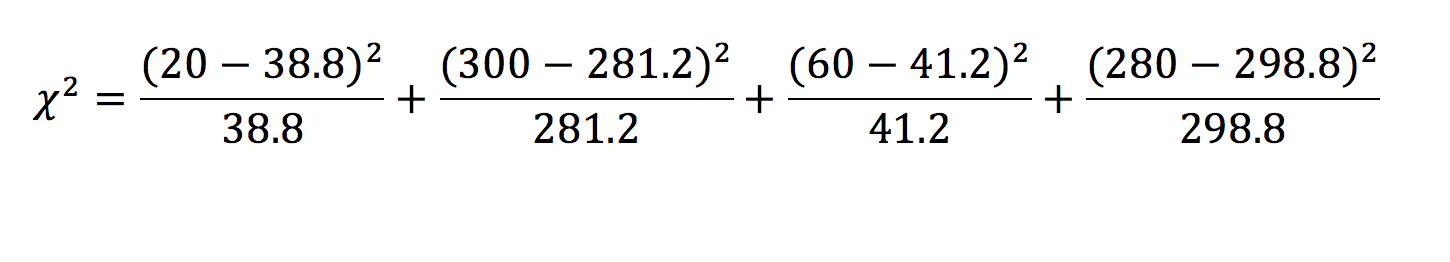
The chi-squared test returns a statistic – the corresponding p-value for this statistic can then be found on a table. In this example, = 20.128 which is greater than the critical value for a p < 0.01. We can, therefore, say with confidence that the effect we have observed is statistically significant, and are thus inclined to reject the null hypothesis.
Degrees of freedom
When looking for critical values in a table, you will often have to find the row with the appropriate number of degrees of freedom. This is simply the number of other categorical outcomes there could have been. In our example, the outcome was a polio diagnosis. One can either have this diagnosis or not – there are two possible outcomes. Therefore there is one degree of freedom, as if a subject exhibits one value for the outcome, in our example, there is only one other outcome they could have had.
![]()
![]()
Risk, odds and hazard ratios
Let’s say we are trying to establish whether there is a link between smoking and lung cancer. Our sample can be split into four groups: exposed with cancer, exposed without cancer, unexposed with cancer and unexposed without cancer (table 5).
| Lung cancer | No lung cancer | |
| Non-smokers | 5 | 50 |
| Smokers | 10 | 45 |
Table 5
Risk ratios (or relative risks) are one way of comparing two proportions. They are calculated with the following equation:
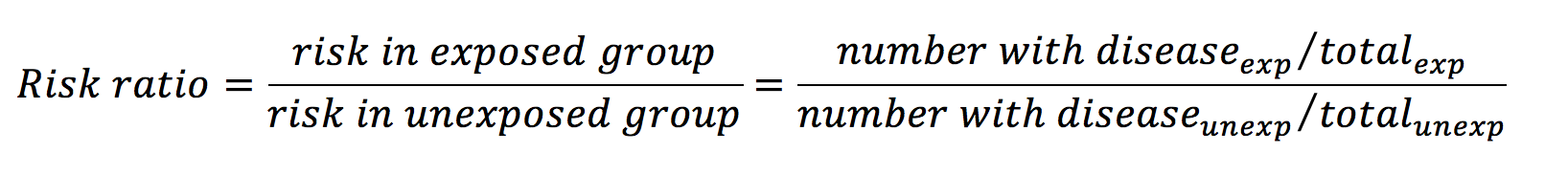
From the data in table 1, the risk ratio is calculated like so:
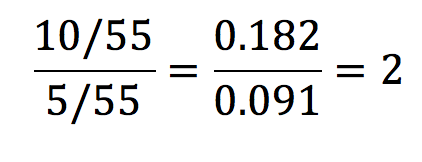
This means that the risk of developing lung cancer is 2 times greater in the exposure group than in the control group. A risk ratio of 1 implies that there is no difference, and a ratio of less than 1 would imply that the exposure had a protective influence over the outcome.
Odds ratios are most commonly used in gambling and are calculated with the equation below:
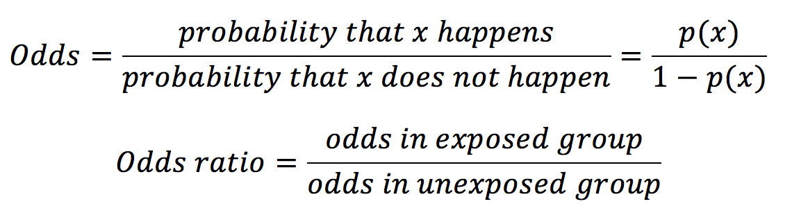
In our example in table 1, the odds ratio would be calculated as below:
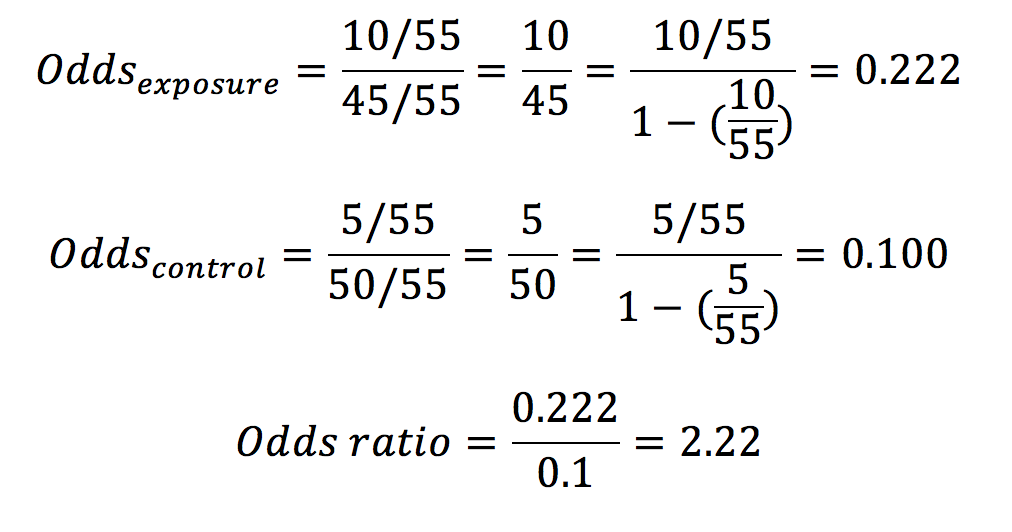
Whereas probabilities can only adopt a value between 0 and 1, odds may have any value from 0 to infinity.
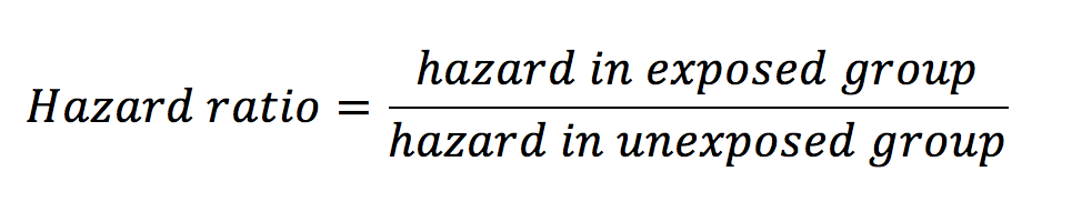
Hazard ratios look at the influence of an exposure on an outcome over time. As with risk and odds ratios, hazard ratios are calculated with the equation below:
Hazard is defined as the risk at any given time of reaching the endpoint outcome in a survival analysis. This outcome is most often death, but it can be other things also such as disease progression. Let’s see an example. Below is a graph from a paper looking at the effect of the humanised monoclonal antibody ocrelizumab on the progression of multiple sclerosis (figure 5) (1).
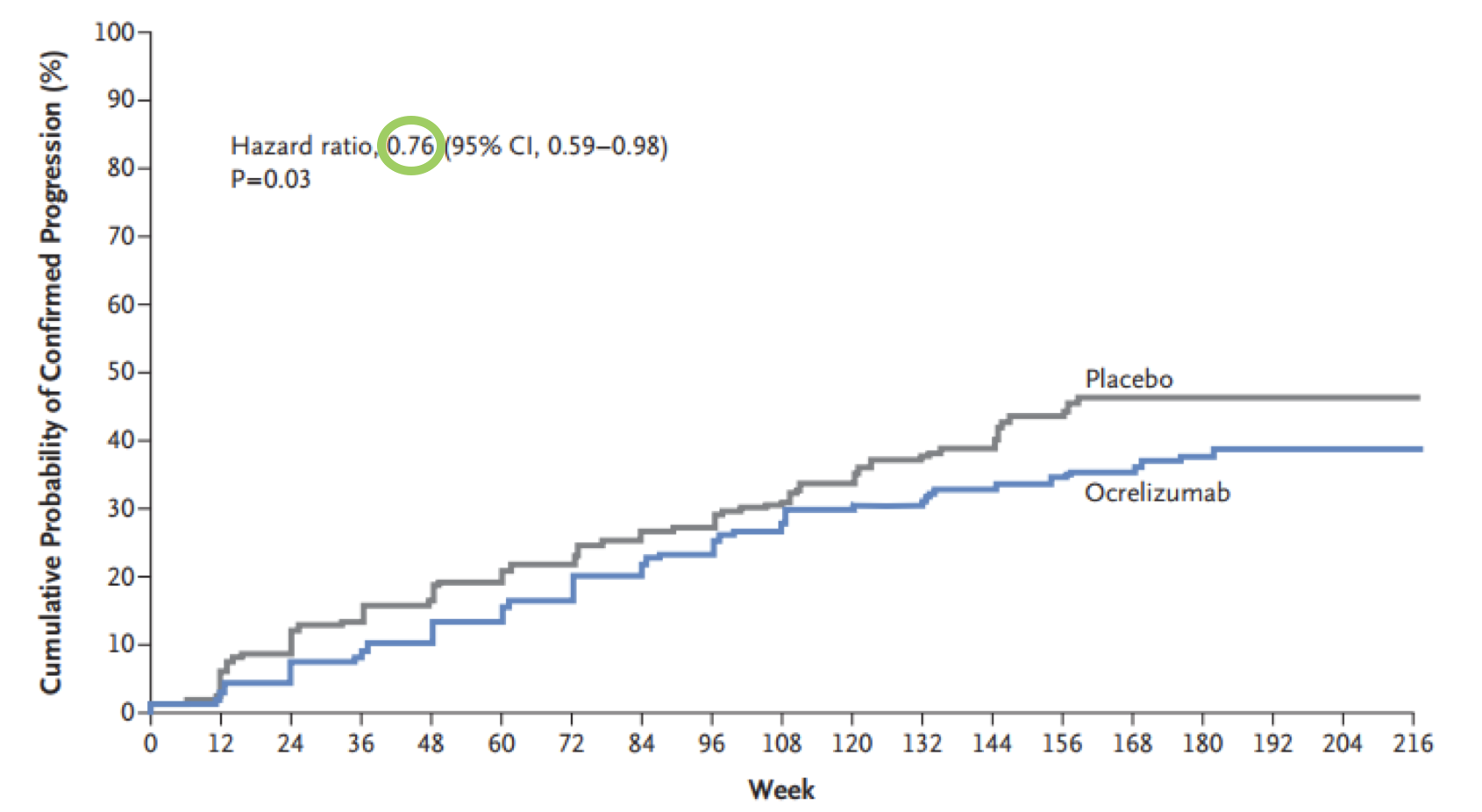
We can see that the hazard ratio here is 0.76 (green circle) – this means that those in the ocrelizumab group at any time were 24% less likely to experience progression than those in the placebo group. Put another way, the probability of progression for an individual in the ocrelizumab group at any given time is 76% that of the placebo group. Whereas a risk ratio would only be concerned with the differences in outcomes at the end of the study, the hazard ratio gives an indication of risk across a period of time.
Number needed to treat and harm
Number needed to treat (NNT) is a popular way of demonstrating the effectiveness of a treatment. It is defined as the number of patients that would have to receive the intervention in question in order to prevent one adverse event. The NNT for a study can be calculated by finding the reciprocal of the difference in risk between the two groups.
Imagine there is a drug that reduces the risk of death following stroke by 20% (this is equivalent to a risk ratio of 0.80). In order to know how significant this is, we must first identify what the risk of death following stroke is without the drug (table 6).
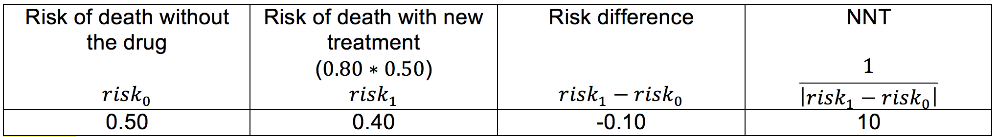
Let’s now apply the information in table 6 to a theoretical population of 5,000 stroke patients. We can see that without the drug we could expect 2,500 of these patients to die (), but with the new treatment, this would be reduced to 2,000 (). In other words, for every 10 patients who are treated with the new drug, there is 1 patient whose life will be saved who would otherwise have died. In a population of 5,000, this means 500 lives will be saved (Table 6).
Number needed to harm is a similar concept only applied to interventions that have a detrimental effect on patient health.
Life tables and Kaplan-Meier curves
Life tables are useful for showing the trend of survival over time when the survival data for each individual is not known. An example of a cohort life table is shown below (Table 7). It is important to consider that death is not the only way that subjects may leave a study. They may be lost to follow-up or they may have to be withdrawn deliberately (this is the ‘number censored’). The risk and chance of survival for any given interval may also then be calculated.
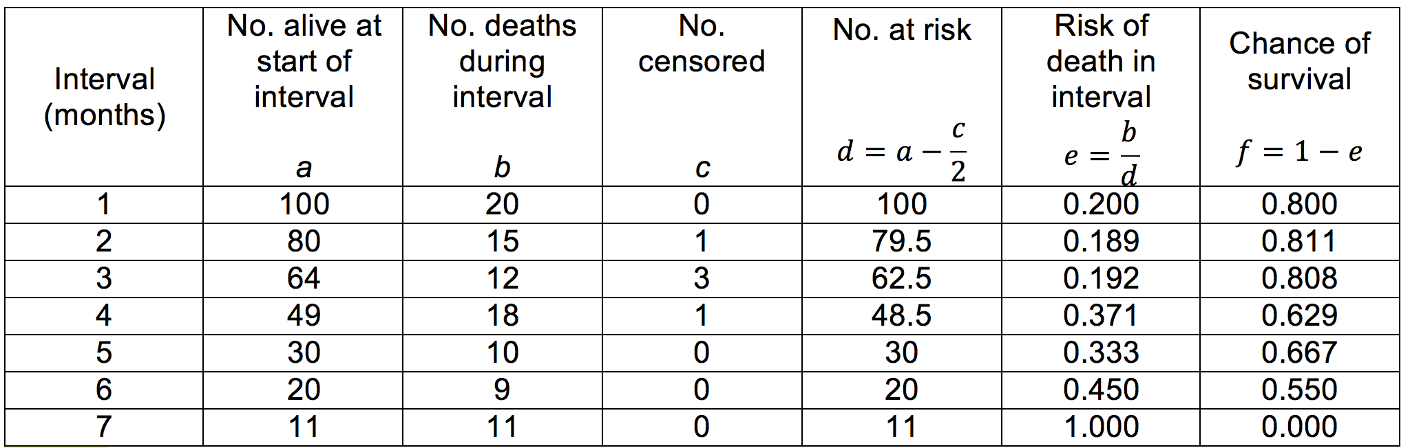
Table 7
The data exhibited in life tables can be used to construct survival curves. We encountered such a graph (a Kaplan-Meier curve) when discussing hazard ratios (figure 5).
Correlation and regression
In layman’s terms, correlation is how strongly an exposure variable is linked to an outcome variable. A correlation coefficient (r) can be calculated to show how well these two variables are associated and can have a value between -1 and 1. The equation for calculating the correlation coefficient in a parametric data set is below:
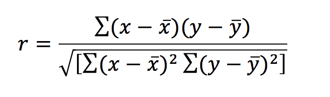
This can look far more daunting than it really is. The symbols x and y denote the exposure and outcomes respectively – x‾ and ȳ represent the means of these. A value of r=0 means that there is no correlation and the data will exhibit a straight line when plotted. When r = 1 there is a perfect positive correlation – when r = -1 there is a perfect negative correlation. Correlation is no longer reliable when looking at data that exhibits curvilinear relationships, as it is likely to identify these data sets as having no correlation.
Regression analyses are other methods to elucidate the relationships between variables. Using these methods we can determine how we could expect one variable to change in relation to the other. The type of regression analysis that should be used differs based on the characteristics of the variables.
Regression assesses the relationship between the mean value of one variable and the deviation from this by other variables. The simplest form of regression is linear regression. The equation for which is below.
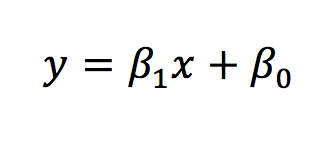
The same equation can be applied to look at how multiple independent variables influence the dependent variable.
In conclusion, correlation assesses the relationship between two variables, returning a single value to represent this (a correlation coefficient). Regression addresses the issue of how much the outcome changes per change in the exposure variable. In using the equation for the line of the plotted data, regression can also be used to predict the values (i.e. predict what the outcome variable value would be for a given exposure variable value).
Sensitivity, specificity, likelihood ratios and predictive values
These terms are commonly used in reference to the effectiveness of a diagnostic tool. To understand them, we must first construct the table below (Table 8).
| Disease | No disease | Total | |
| Positive result |
a (true positive) |
b (false positive) |
a + b |
| Negative result |
c (false negative) |
d (true negative) |
c + d |
| Total | a + c | b + d | a + b + c + d |
Table 8
From this table, it is clear that if we want a good diagnostic tool, we want a and d to be very much greater than b and c. Sensitivity is defined as the proportion of those with the disease who are correctly identified by the test. In contrast, specificity is the proportion of those without the disease that are correctly identified by the test.
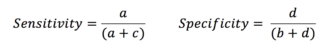
Let’s look at the example of a d-dimer test. This is a sensitive test for myocardial infarct, as in patients with an MI the d-dimer is very likely to be raised. There are very few false negatives (i.e. people with MI who are missed). However, the test is less specific as there are many phenomena other than MI that may raise a d-dimer. This leads to an increased number of false positives. This does not mean that the test is showing up that the patient has a raised d-dimer when they actually have a normal level – it shows that there many people with raised d-dimers for reasons other than MI.
Likelihood ratio (LR) is linked to sensitivity and specificity. The LR for a positive result is the chance of a true positive versus that of a false positive. An LR of 3 indicates that if the result is positive, the subject is three times more likely to truly have the disease than not.

Sensitivity and specificity tell us about the diagnostic capacity of the test. However, the predictive values demonstrate how likely it is that an individual does or does not have the disease based on their test result.
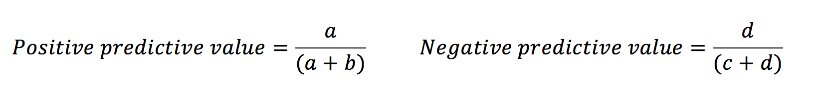
This is because the predictive values are influenced by the prevalence of the disease amongst those in the study. Likelihood ratios give similar information to predictive values, however, they are not influenced by the prevalence of the disease.

Glossary of symbols
Symbols differ depending on whether they refer to the sample or the real population. Other general symbols and abbreviations are defined below also.

References
Image references
- Montalban X, Hauser SL, Kappos L, Arnold DL, Bar-Or A, Comi G et al. Ocrelizumab vs placebo in primary progressive multiple sclerosis. New England Journal of Medicine 2017;376(3):209-220.
- NIST/SEMATECH e-Handbook of Statistical Methods. Normal distribution image. Available from: [LINK].
- Saylor Academy. Normal distribution image. Available from: [LINK].
- Study.com. Skewed distributions image. Available from: [LINK].
Text references
- Kirkwood BR, Sterne JAC. Essentials of medical statistics, 2nd ed. Oxford: Blackwell Publishing Ltd; 2003.
- Petrie A, Sabin C. Medical statistics at a glance. Chichester: John Wiley & Sons Ltd; 2009.
- Le T, Bhushan V, Sochat M. First aid for the USMLE step 1 2016. New York: McGraw-Hill Education; 2016.
- Lane DM. Online Statistics Education: A Multimedia Course of Study. Available from: [LINK].
- Peacock J, Kerry S, Balise RR. Presenting Medical Statistics from Proposal to Publication: A Step-by-step Guide, 2nd ed. Oxford: OUP; 2017.
